
How to design the front page of your B2B Knowledge Center
Just a few weeks ago, we published an article titled “The Perfect Home Page.” Given the abundance of positive feedback received, I thought I’d keep the momentum going.
In that article, I said your home page is the most important page on your website. So with that one behind us, let’s take a look at your second most important page.
That’s the front page of your Knowledge Center.
It goes by many different names, like Knowledge Center, Resource Center, Learning Center, Content Hub or Blog. Whatever you call it, we’re talking about the same thing: A place where your thought-leadership content lives.
What exactly is “thought-leadership content”?
When I say “thought-leadership content,” I’m talking about genuinely helpful content that creates significant value for your prospects, leads and customers.
That means:
- Articles that help solve problems and answer common questions
- White papers and guides that explore those topics at a deeper level
- Tools, videos, buyer’s guides or anything else you’ve published to objectively help the key buying process influencers from the types of companies you serve
What I’m not talking about are:
- Company news updates
- Press releases
- Information about your products and services
- Anything that preaches about how great your company is
It drives me nuts when I visit a company’s blog and find nothing but recaps of company picnics, updates on people they’ve hired and announcements of accounts they’ve won.
Visitors come to your Knowledge Center to get questions answered and problems solved. There’s a time and place for talking about yourself. It’s not here.
End rant. Here’s how I recommend structuring your Knowledge Center.
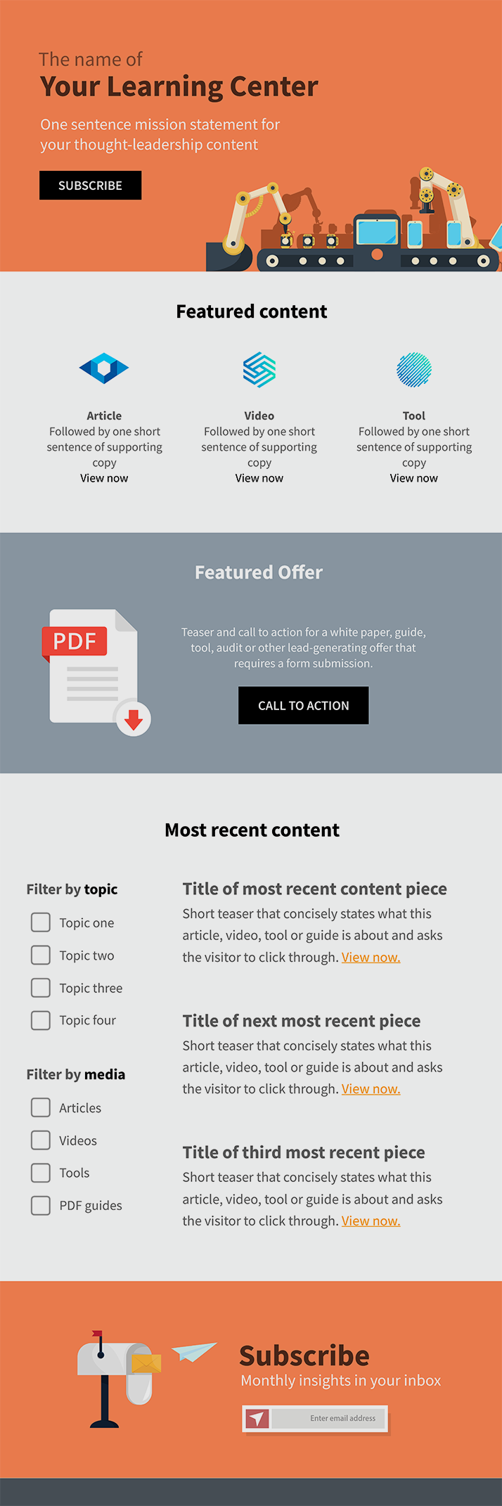
The perfect Knowledge Center wireframe
The wireframe (or page blueprint) below is for the front page of a Knowledge Center.
Think of this page as an index for all the incredible content you’ve published (or will publish into the future).
Let’s start up at the top.
Headline and mission statement
The first thing you want to do is to reassure your visitors they’re in the right place.
I personally love the idea of giving your Knowledge Center a branded title or name. It’s a simple way to make your content hub feel more substantial.
At Gorilla, we call ours “The Industrial Marketing Strategy Learning Center.”
Follow that up with a brief, one-sentence clarifying statement. Or better yet, a mission statement for your content. Author and founder of the Content Marketing Institute, Joe Pulizzi, talks about the importance of a content mission statement in this article.
Ours reads like this:
“An ever-expanding collection of articles, videos, guides and tools to help manufacturers identify, attract, engage and drive sales with ideal-fit customers.”
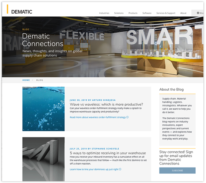
The supply chain optimization experts at Dematic run an exceptional blog that I highly recommend flagging for inspiration. They call theirs “Dematic Connections” and offer a simple but effective descriptor right under the title.
I also recommend placing a simple call to action to subscribe beneath the title and mission statement.
This is a quick and easy way to build your email list. So simply ask, and keep the barrier low. Request only the most essential information here. Anything beyond a name and email address is probably too much.
Notice how Dematic handles their “Subscribe” call to action in the side bar above.
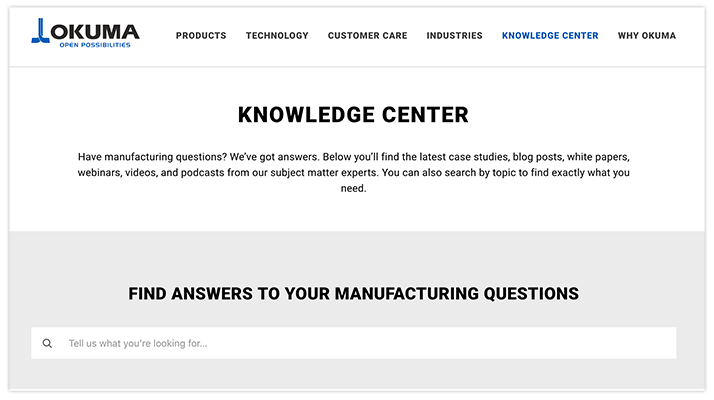
The machinery manufacturer Okuma also manages a great content hub. In particular, I love how they introduce their Knowledge Center and follow the summary by prompting visitors to ask a question:
Featured Content
The next section of your Learning Center should highlight your absolute BEST content.
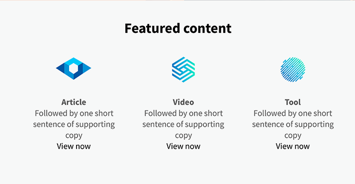
This is a great place to feature some of your most popular articles, videos, tools or guides.
Whether you draw from your website analytics to decide what’s “most popular” or make a gut decision, the idea is to show your visitors content that’s most likely to capture their attention and keep them engaged.
One of our clients, Arnold Machine, Inc., features some of their best guides near the top of their Learning Center:
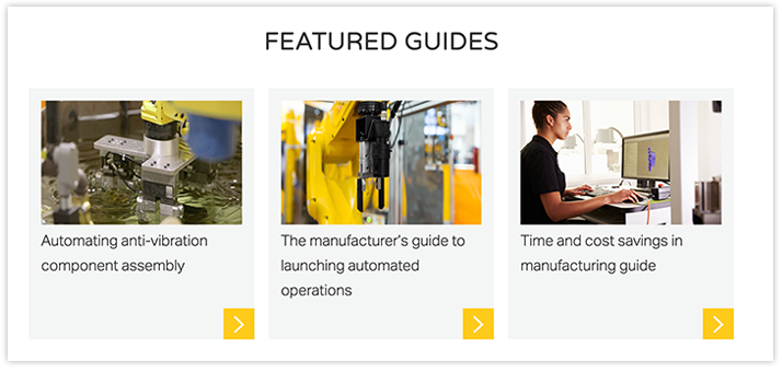
Swap out these highlighted content items periodically as you see fit. As long as you’re using a flexible content management system like WordPress, this should be simple enough to do.
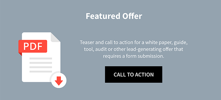
Offer
If you read our article about The Perfect Home Page, this next section should look familiar.
Use this area to call attention to your absolute best content offer or something of value you can trade your visitor in exchange for contact information.
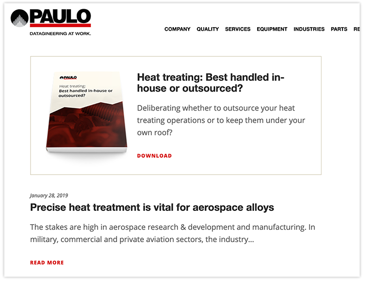
You can see how the thermal processing experts at our client Paulo handle calls to action in their Learning Center. They pull in various calls to action throughout the page, starting with one at the very top:
Most Recent Content feed
Next up is a significant chunk of real estate for brief intros to every piece of thought-leadership content you publish, displayed in reverse-chronological order.
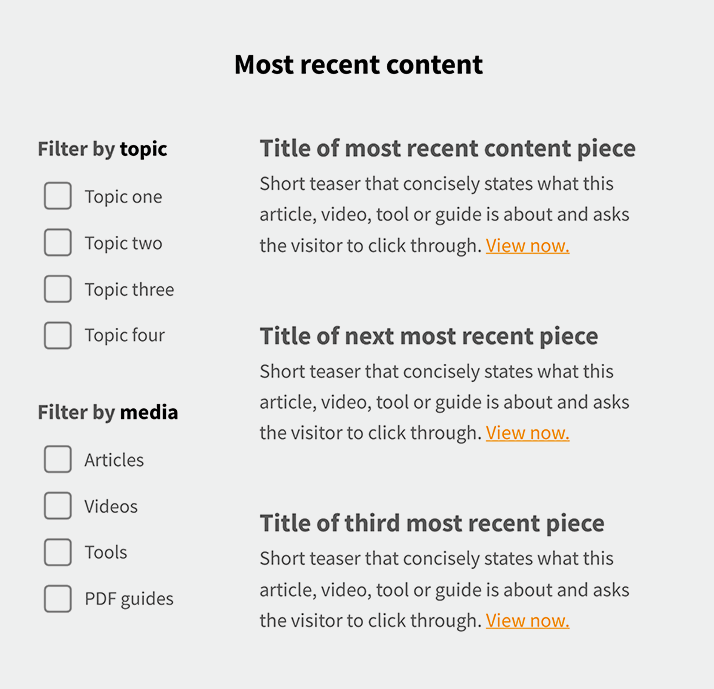
I recommend prominently displaying the title of each piece and following with a brief description of what it’s about.
Often by default, your content management system will show the first few lines of copy from the piece here, with a “keep reading” call to action. This works fine, but I also think it’s a wasted opportunity to sell your visitor on why he or she should click through.
With a simple development hack, you could set up a custom field to write whatever you wish in this space. Customize it with a one-line teaser advertising the article, video, tool or guide.
Or, as we do on the Gorilla site, you can code the page to pull in your meta descriptions (short overviews that help your audience and the search engines understand what your content is about).
Regardless, keep the teasers short and sweet. It makes it easier for visitors to scan the Knowledge Center front page and quickly find what’s most relevant to them.
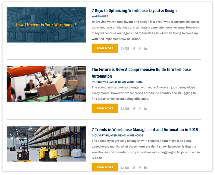
Here’s an example from the manufacturing automation company Nitco’s blog:
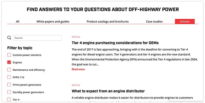
Adding filters that let visitors easily sort through content to locate what most interests them can make a Knowledge Center even more useful.
Until you have at least 10-20 content items in your Knowledge Center, I don’t recommend filters. But once you’ve committed to publishing a variety of exceptional thought leadership content, you want to make it as simple as possible for your visitors to find what they’re looking for.
You can see below how our client CK Power’s Resource Center content can be filtered both by media type (White papers and guides, Product catalogs and brochures, Case studies and Articles) and topic (Custom power solutions, Engines, Maintenance and efficiency, etc).
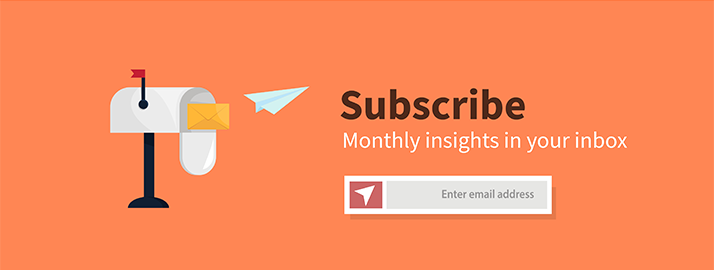
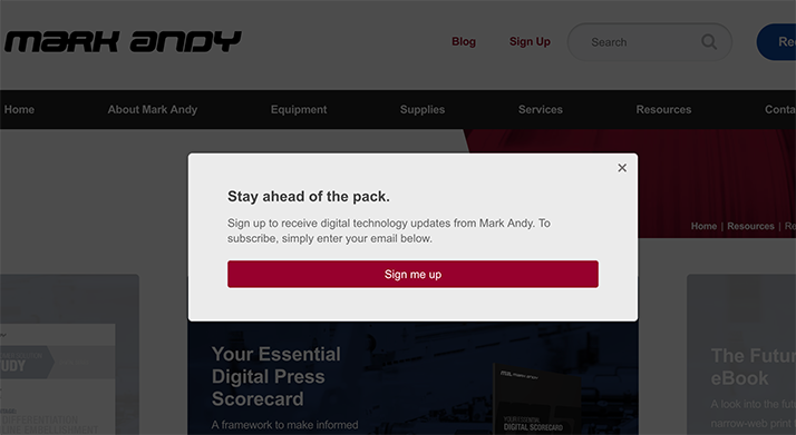
One more subscribe call-to-action
Finally, if your visitors have taken the time to scroll all the way through this page (and now have a sense for what this content is all about), let’s ask them once more to subscribe.
Another way to do it is with a pop-up prompt to subscribe like the printing equipment manufacturer Mark Andy does here:
Wrapping up
Without question, your Knowledge Center’s success depends on the quality of your content above all else.
Without truly exceptional, problem-solving, question-answering content for the right people from the right companies, a conversation about its layout is moot.
But once you’ve committed to consistently publishing thought-leadership content, this wireframe should serve as your guide.

