
How to design the perfect B2B website home page
Chances are more than half of your website visitors will enter through your home page. And within 15 seconds, they’ll decide whether to stay or go.
So if you’re a believer in making a good first impression, it’s fair to say that your home page is pretty darn important.
But how do you design the perfect home page?
If this is the first look a future customer will get at your business, what bits of information do they need in those critical opening seconds?
How do you capture their attention fast? And retain it long enough so they stay and explore for another 15 seconds?
How will you help them uncover not only what they want to find, but also what you want them to see?
Here’s your blueprint
What you’re looking at here is a sample home page wire frame.
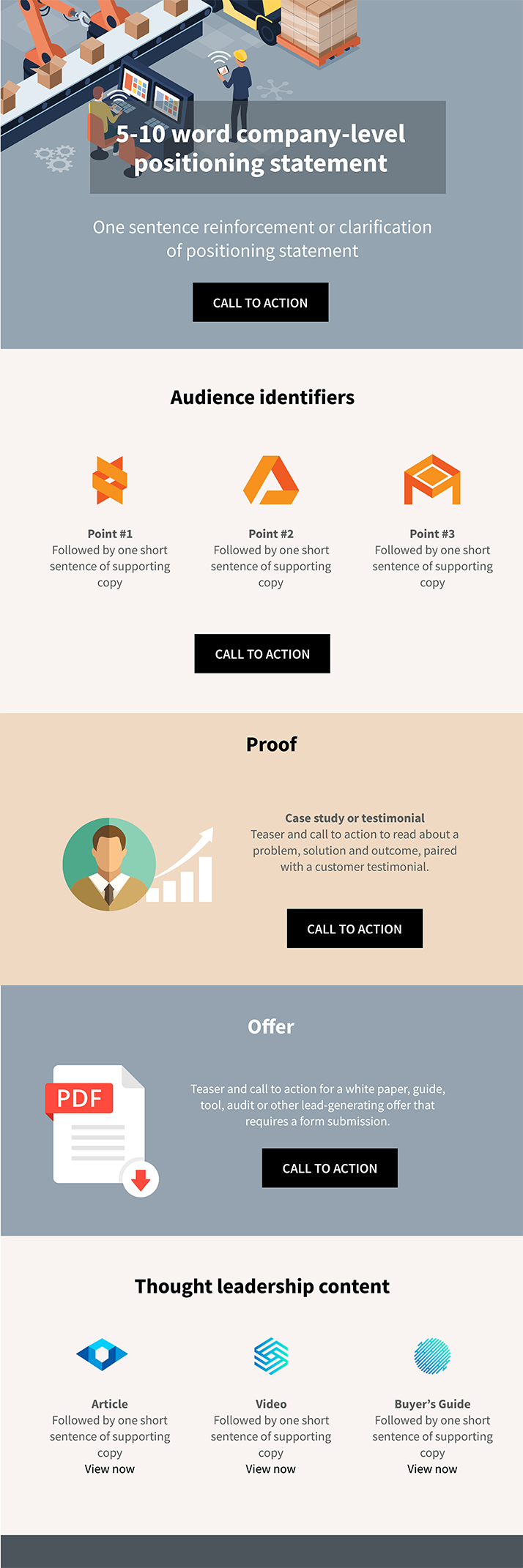
If you’re not familiar with the term, a wire frame is essentially a blueprint.
It’s a simple, graphic representation of the information hierarchy for a specific page on your website – in this case, your home page.
The idea is to plan what information needs to be present, where every element will sit on that page and how much real estate to give each, relative to everything else.
Take a quick look through the layout and when you’re ready, let’s start our tour. Below I’ll take you through each section one by one and explain their roles.
Throughout the article, I’ll also reference a real-life manufacturer home page for context (and inspiration for how to do it right). So open up the Midwest Industrial Rubber website in a new tab.
We’ll bounce back and forth between here and there as we go to give you some context for what we’re looking at.
OK, ready? Let’s start at the top.
1. Positioning statement
When the right people from the right companies land on your site, you want them to say immediately, “Yep, I’m in the right place”.
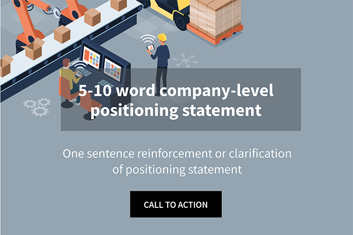
So give them a big, bold five-to-eight word headline that identifies your company. Then follow with a super concise, one-sentence positioning statement that looks something like this:
We help [TYPES OF COMPANIES] achieve [DESIRED OUTCOME] with/by [YOUR SOLUTIONS].
If you only have 15 seconds to capture their attention, let’s use the first five to state simply who you help and how.
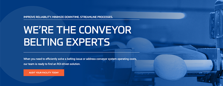
Here’s how Midwest Industrial Rubber (let’s call them MIR) does it:
The topic of Positioning is one for another article (or white paper (or 300-page book)), but here’s my simplest bit of advice on the subject:
When you try to be everything to everyone, you’ll only spread yourself thin, posing as a jack-of-all trades who’s really a master of nothing at all.
So who are you trying to speak to on this website? Who are those ideal customers? And what is your value proposition for them?
State it simply and find an image thats complements your positioning statement without overpowering it.
Finish strong with a call to action.
‘Whether you send them to a Who We Help and How page, a products or services overview page or a lead-capture landing page, provide some guidance on where they should go next.
2. Audience Identifiers
Next up are what we call “Audience Identifiers”.
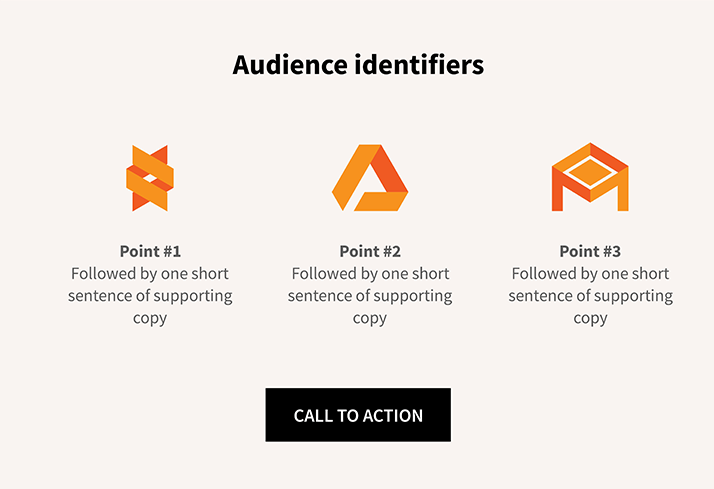
The idea – now that you’ve succeeded in keeping your visitors past the five or ten-second mark – is to help them quickly identify with key issues they’re experiencing or goals they’re trying to achieve.
We need to make them say, “these guys understand companies like ours”.
You could use these icons and snippets to say:
“We solve problems like… [BULLET, BULLET, BULLET]”
OR…
“[TYPES OF COMPANIES] come to us when… [BULLET, BULLET, BULLET]”
Here’s how MIR handles their audience identifiers:
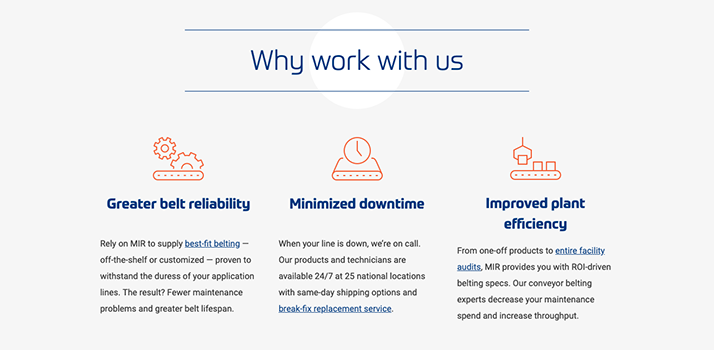
At the end of the section, you once again want to give your visitors a next step. So point them in the right direction with another call to action.
3. Proof
News flash: Your audience does not care who you are or what you do until they believe:
- You’ve seen their issues before
- You understand those issues
- You’ve tackled them for other companies like theirs
This is your place to demonstrate you’ve walked the walk.
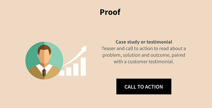
If you already have some documented cases studies in hand, great. Use this section to highlight your best one (or two or three). And drive your visitors there.
If you don’t, now’s as good a time as any to get a few success stories in the works.
Here’s my recommended format for how to tease them on your home page:
- Head shot of a REAL happy customer
- One-sentence testimonial quote
- One sentence summarizing the problem solved or outcome achieved
- Call-to-action linking to the full case study
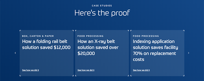
MIR keeps theirs simple:
4. Offer
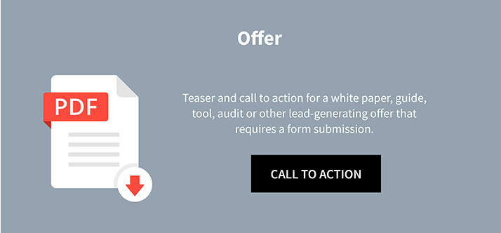
An offer is something of value you can trade your visitor in exchange for contact information. This is your chance to generate a lead, right there on your home page.
There are a few directions you could go with your offer.
You could promote a downloadable asset like a free white paper, buyer’s guide or tool.
For all the anonymous visitors on your site that may be sales-qualified but aren’t yet ready for a conversation, we need to give them a reason to convert into a tangible lead.
If your resource is well-positioned to your audience and appears valuable, it could become a lead-generation machine for you.
Alternatively, you could deploy a more sales-focused offer like suggesting a free consultation or promoting a site audit service like MIR does:
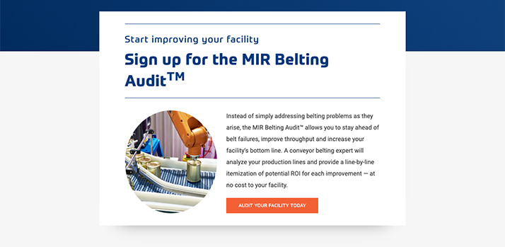
When you go this route (bottom-of-funnel offer), you’ll get less bites, but your leads will also be more sales-ready.
5. Thought-leadership content
The last key section of this home page wire frame is an area to highlight some thought-leadership content.
And by that I’m referring to the problem-solving, question-answering resourceful content you publish for your ideal customers.
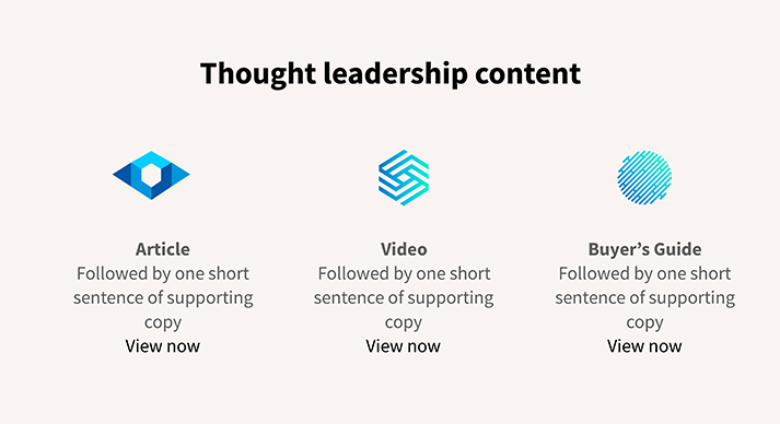
There are a few ways to do this.
You could feature one blog post or article, one video and one white paper or tool that you’ll manually select and update from time to time.
A simpler option is to let your website auto-populate this area with your three or four most recent pieces of content, as MIR does in the left and middle columns below.
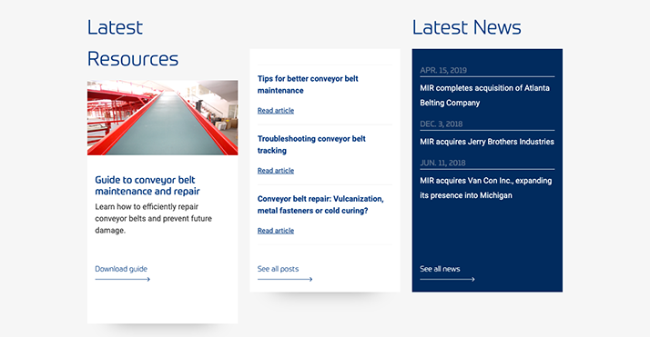
Regardless, this is your place to feed fresh, helpful insights for your visitors into your home page.
Grab a hammer
Time to start building.
This wire frame may not be 100% right for you. But if you’re a B2B company in the industrial sector, I’m willing to bet it’ll get you 90% of the way there.
So use this wire frame as your guide and alter as you see fit.